More than just pretty words: the how and why behind the what.
Every piece of content I create - whether it be for a transactional mobile flow, overarching desktop experience, product description, or a conversational chatbot - is rooted in an obsession for the user and a keen compassion for their humanity.
I make strategic decisions that are rooted in data, research findings, an intricate study of customer behavior, and empathetic perception. I write with simplicity and meaning, keeping my audience in mind with each intentional word.
While every project demands a unique approach, my process typically includes the following:
+ Identifying a problem that needs to be resolved or a goal that needs to be communicated through the experience and establishing a clear solution through the user flow, content architecture, and overall tone.
+ Diving into deep, strategic research by conducting competitor analyses, determining a target audience through granular demographic study and data review, and creating personas and empathy maps to further understand and speak to the user's needs, emotions, and goals.
+ Collaborating with cross-functional teams of UX/UI designers, data scientists, business analysts, marketing managers, SEO specialists, and engineers to create a cohesive content and design narrative rooted in research findings and a solid understanding of the user.
+ Performing usability and A/B testing between experiences, analyzing customer behavior and interaction, and making strategic content iterations to solve specific pain points that are determined.
Work samples and content strategy case studies.
SaFEco insurance: DESKTOP EXPERIENCE content and strategY


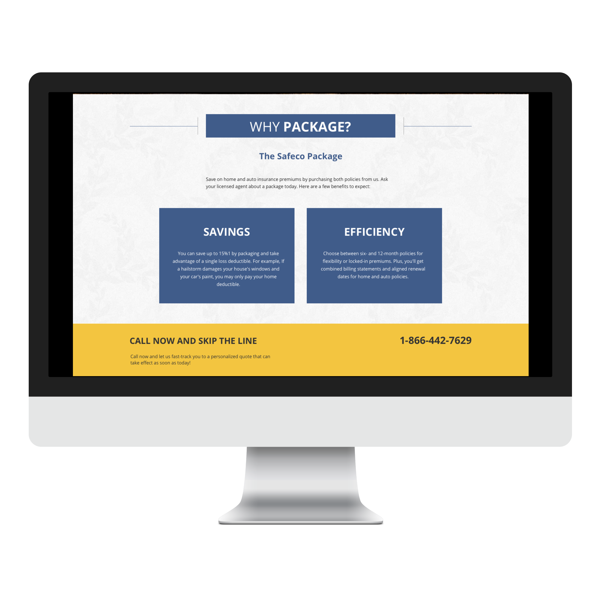
Project: Create a refreshed experience for SafecoInsurance.com to increase response rate, conversion, and drive sales for Safeco Insurance, one of Red Ventures' business partners.
Scope: Craft new content for a simple, meaningful user experience, including compelling headlines, informative body copy, and clear CTAs.
My Role: Content Strategist.
Stakeholders and Collaborators: Data Analysts, UX/UI Designers, and Safeco Insurance business partners.
Goal: Increase response rate and conversion. Weed out existing customers while building trust with potential customers. Inform users of what Safeco Insurance offers and provide a way for them to easily learn about their coverage options and get an online quote.
Challenges: Insurance is a highly regulated, nuanced industry. Because certain restrictions were in place, my team and I were required to carefully navigate this project. We had to avoid content that was overly promising while creating a streamlined transactional experience with straightforward, yet emotional, messaging.
Process Overview: Engage in a kickoff meeting with a cross-functional team, review data from current experience, review pain points and goals, conduct a content audit of existing site and a competitor analysis, craft user personas based on data findings, whiteboard a strategy and user flow with UX/UI designer, and craft messaging to fit the new experience.
Process Details: Red Ventures holds two values in high esteem: agility - every project is structured as a sprint - and quality, which should never be compromised by speed. As a content strategist on the insurance business, my team was tasked with revitalizing a desktop experience for one of our partners, Safeco Insurance.
To tackle this project, a kickoff meeting with myself, a UX/UI designer, and a data analyst was organized. After reviewing data from our current experience, we found that many existing Safeco customers visited our sites but were not looking to add a policy, so we wanted to give them a way to navigate away from the experience and to a page where they could report a claim under their current policy. We also learned that many visitors - and Safeco customers - were part of a primarily young, millennial demographic.
With this information, we decided to gear the experience toward this user base. After creating a user flow in a whiteboard session, we decided to center the experience around messaging and imagery that would appeal to the user's emotions and motivations: protection for their growing family and new, costly investments. Collaborating with a UX/UI designer, I wireframed content that would speak to our users' needs and aspirations while addressing specific data-driven user needs: existing customers looking to file a claim and first-time customers unsure of their coverage options.
To immediately weed out existing customers, we placed a portal icon in the top navigation of the page, as well as a CTA that led them to manage their account without calling in at the bottom of the page. This ultimately increased conversion since all calls were strictly potential customers looking to purchase a policy for the first time.
NATIONWIDE INSURANCE: DESKTOP EXPERIENCE CONTENT AND STRATEGY


- Project: Create desktop experiences for Nationwide Insurance.
- Scope: Craft content for a streamlined user experience, including compelling savings-driven headlines, informative body copy, and clear CTAs to drive sales.
- My Role: Content Strategist.
- Stakeholders and Collaborators: Data Analysts, UX/UI Designers, and Nationwide Insurance business partners.
- Goal: Build value around the Nationwide brand with a meaningful, customer-obsessed experience. Inform users of what Nationwide Insurance offers and provide a way for them to easily learn about their coverage options, get a quote, and call to enroll in a policy.
- Challenges: Insurance is a highly regulated, nuanced industry. Because certain restrictions were in place, my team and I were required to carefully navigate this project. We had to avoid content that was overly promising while creating a streamlined experience with straightforward, yet emotional, messaging.
- Process Overview: Engage in kickoff meeting with a cross-functional team, review data from target demographic, establish goals, conduct a competitor analysis, craft user personas, user journeys, and empathy maps based on findings, whiteboard site flow and wireframe with UX designer, and craft messaging to fit the experience.
Process Details: As a content strategist on Nationwide Insurance, one of Red Ventures' business partners, my team was tasked with designing and launching an experience that informed users of the products Nationwide offers and get an online quote while driving them to call and enroll in a policy over the phone.
To tackle this project, a kickoff meeting with myself, a UX/UI designer, data analysts, and other stakeholders was organized. After reviewing data provided to us by Nationwide business partners regarding site goals and the target demographic, we found that our target user base was primarily middle-aged families looking to protect their possessions with a reputable insurer.
With this information, we decided to gear the experience toward this user base. After creating a user flow in a whiteboard session, we decided to center the experience around messaging and imagery that would speak to protecting the customer's family and valuable possessions and allow them to save money in the process.
NATIONWIDE INSURANCE: MOBILE EXPERIENCE AND CONTENT STRATEGY

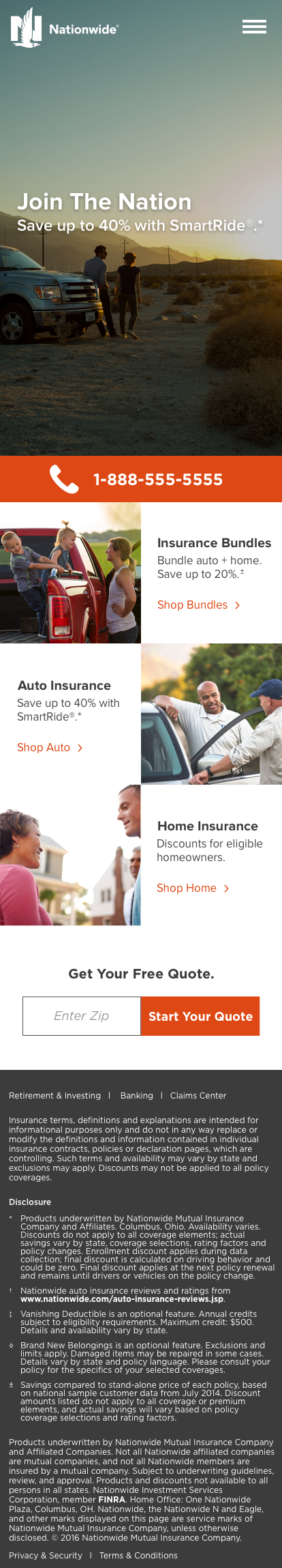

- Project: Create a mobile experience for Nationwide Insurance.
- Scope: Craft content for a simple, meaningful mobile experience that remained succinct and cohesive with the Nationwide desktop experience.
- My Role: Content Strategist.
- Stakeholders and Collaborators: Data Analysts, UX/UI Designers, and Nationwide Insurance business partners.
- Goal: Inform users of what Nationwide Insurance offers and provide a way for them to easily learn about their coverage options and call to enroll in a policy.
- Challenges: Insurance is a highly regulated, nuanced industry. Because certain restrictions were in place, my team and I were required to carefully navigate this project. We had to avoid content that was overly promising while creating a streamlined experience with straightforward, yet emotional, messaging.
- Process Overview: Engage in kickoff meeting with a cross-functional team, review data from target demographic and user information from desktop experience, wireframe with UX designer, and craft messaging to fit the mobile experience.
Process Details: As a content strategist on Nationwide Insurance, one of Red Ventures' business partners, my team was tasked with designing and launching a mobile experience that informed users of the products Nationwide offers and drive them to call and enroll in a policy over the phone.
To tackle this project, a kickoff meeting with myself, a UX/UI designer, data analysts, and other stakeholders was organized.
We used information and data regarding our target demographic to match our desktop experience, gearing the mobile experience toward the same user base. After wireframing with a UX/UI designer, I crafted simple, streamlined content to allow users to explore policy options before calling in to enroll in a policy.
STATE FARM: DESKTOP EXPERIENCE AND CONTENT STRATEGY

Click to expand image in a new window.
The above wireframe shows a work in process and the essential collaboration between content strategist and designer. Since every project is approached with a content-first mindset, I worked hand-in-hand with a UX/UI designer to formulate a strategy for where content would live on the page. After this was crafted, I wrote new content using some pre-approved messaging and some new messaging for the designer to place into the design before the UI was finalized.
- Project: Craft content for three interior pages of an existing State Farm experience to build value and quality around the brand rather than focus on strict savings messaging.
- Scope: Create simple, compelling headlines, module copy, and CTAs for three interior pages: a State Farm value page, an auto insurance page, and a home and auto bundles page.
- My Role: Content Strategist.
- Stakeholders and Collaborators: Data Analyst, UX/UI Designer, and State Farm business partners.
- Goal: Increase response rate and conversion. Drive new customers to the phone and enroll in a policy through compelling and direct CTAs. Build value around the quality of the State Farm brand.
- Challenges: Insurance is a highly regulated, nuanced industry. Additionally, State Farm had very specific brand guidelines that it required us to maintain. Because these restrictions were in place, my team and I were required to carefully navigate this project while creating a streamlined, user-centric experience.
- Process Overview: Conduct user research and evaluate data from current control experience, create a user persona, empathy map, and customer journey to further understand audience, engage in a white-boarding session with stakeholders, create user flow and wireframe with UX/UI designer, and write content.
Process Details: On the insurance team at Red Ventures, we created many experiences while we were business partners with State Farm. Working for one of the largest - and oldest - insurance companies in the United States gave me keen insight into navigating data and customer behavior from many different people groups and weighing them against pain points to create the most granular user experience possible.
After receiving analytics and data from our existing State Farm experiences, we found that a large number of our user base who explored our sites on desktop and mobile and were primarily iOS and MacBook users. This keyed us in to a very compelling trait about them: Apple users are very brand-loyal and quality means a lot to them. Knowing this, much of the content I crafted included value props surrounding the quality State Farm provides, as well as statements about its reputation of excellence. Futhermore, since I knew many of our user demographic was easily swayed by word-of-mouth and friend or family referrals, I framed much of the content with this in mind.

Click to expand image in a new window.
After analyzing data and customer behavior learnings from previous State Farm experiences, I crafted personas to further understand the needs, motivations, and goals to create a user-centric experience. The above is one persona I used while making iterations and writing new content for the interior pages of one of our State Farm experiences.
The following content reads left to right in correspondence with the above left wireframe.
Headline: Why State Farm?
Subhead: When you think of insurance, there's a reason our name comes to mind
CTA: Want to learn more? Call 1-855-555-5555 today.
Content Block #1:
We’re different. On purpose.
Not all insurance providers are created equal. For nearly 100 years, the quality, value and service provided by State Farm
has made us a leader in the industry.
Content Block #2:
We insure more homes and cars than any other provider in the United States.
We handle roughly 37,000 claims per day and offer personalized service every time.
We have 18,000 local agents across the United States ready to help when you need them.
CTA: Join the millions. Protect what matters most with the best. Call 1-855-555-5555 today.
Content Block #3:
Getting a policy with State Farm is simple. In one call, you'll get:
- Answers to all of your questions
- A free quote in minutes, customized just for you
- Discounts you qualify for applied to your account
- Contact information for your local agent
- Instant, electronic proof of insurance
- Protection you need, effective immediately
1. Pick up the phone and call 1-855-555-5555. State Farm representatives are standing by to help you get a free quote in minutes.
2. Our experts will answer any questions you may have, explain how your policy can protect you and see if you’re eligible for one or more of our discounts. We’ll help you find coverage that meets your needs, so that you can have peace of mind knowing you’re protected by the best.
3. As soon as you purchase a policy, you’ll get proof of insurance and the name and number of your local agent. They’ll be right there with you every step of the way, from explaining your coverage to handling your claim.
CTA: Ready to get insured today? Call 1-855-5555 to get the coverage that meets your needs.
FRONTIER INTERNET: MOBILE CART MICROCOPY CONTENT STRATEGY


- Project: Resolve mobile cart dropoff on Frontier.com by adding microcopy and a progress bar to guide users through the purchasing process.
- Scope: Since users seemed unaware of how long the purchase process would take, we were seeing dropoff and cart abandonment just before the purchase was completed. Our hypothesis was that adding microcopy and a progress bar and breaking the content up on multiple pages would resolve these issues.
- My Role: Content Strategist.
- Stakeholders and Collaborators: Data Analysts, UX/UI Designer, and Frontier business partners.
- Goal: Create friendly, user-centric microcopy to prompt customers to move to the next step and complete their purchase. Establish peace of mind with security microcopy.
- Challenges: Determine the categories that would best explain the many steps of the checkout process and organize content accordingly.
- Process Overview: Conduct user research, evaluate data from current experience to determine pain points and reasons for dropoff, engage in a whiteboarding session with stakeholders, craft a strategy and wireframe with UX/UI designer, write content, share prototype with stakeholders, finalize content and design, test, evaluate results, and make iterations as needed.
Process Details: The premise of this project was to craft microcopy for a progress bar that would remain sticky at the top of the page and user prompts to guide them through the process. To make checkout appear as simple and streamlined as possible, I determined that breaking the process into four main categories that would be shown in the progress bar would be the most effective strategy. This would allow users to see exactly where they are in the checkout process and assure them that it wouldn't take long to complete. Next, I felt that breaking up the contact info and security question steps by adding a human tone with prompts would provide users with peace of mind.
HUGHESNET: DESKTOP EXPERIENCE CONTENT AND STRATEGY

- Project: Create a new HughesNet page to describe Gen5, the new-and-improved version of HughesNet Internet with faster speeds and a more reliable connection.
- Scope: Clearly describe the features and value props of the Gen5 upgrade while staying true to the HughesNet voice and brand guidelines. Drive potential customers to the phone and increase conversion rate.
- My Role: Content Strategist.
- Stakeholders and Collaborators: Customer Experience Analyst, UX/UI Designer, HughesNet Marketing Director, and HughesNet business partners.
- Goal: Create a simple, informational page and streamlined user experience for Gen5. This experience is intended to drive customers to call in and place an order or to fill out a lead form to request a call.
- Challenges: Describe the features of Gen5 and its corresponding EchoStar XIX satellite without overloading the user with technical product information.
- Process Overview: Conduct user research, evaluate data from past HughesNet experiences, engage in a whiteboarding session with stakeholders, craft a strategy and wireframe with UX/UI designer, write content, share prototype with stakeholders, finalize content and design, test, evaluate results, and make iterations as needed.
Process Details: The premise of this project was to create an updated page for one of our HughesNet Internet experiences to explain the features of Gen5 and EchoStar XIX, the newest upgrade to HughesNet Internet and its corresponding satellite. To start this project, myself and a cross-functional team of data analysts, UX/UI designers, and marketing directors held a kickoff meeting to evaluate the scope of the project, identify the direction we needed to take based on prior findings, and establish a clear, cohesive goal.
Based on data from previous HughesNet experiences, I knew that our customer base was a primarily young-family to middle-aged, rural demographic. We also knew that many of our existing and potential customers were familiar with dial-up internet as their primary source of connection. With this information, we determined that our users were primarily looking for a service that would provide faster speeds and an uninterrupted connection so they could easily perform simple, low-data tasks such as checking their email and occasionally streaming music or video. Finally, based on data pulled by our analysts from previous tests, we also knew that many of our users preferred calling in to speak with a customer service representative to spending a lot of time online perusing plans.
A pain point we found from some of our prior experiences was a low response rate. Customers weren't calling in because the phone number wasn't clearly displayed, so the UX/UI designer and I collaborated and opted to intentionally place a CTA to drive users to call in the hero of the site. Since many of our users would be viewing the site on a desktop, we knew that slightly longer, informative - yet still succinct - content would be the best course of action when structuring the page.
LUMA SURVEILLANCE: TRANSACTIONAL EMAIL & PRINT AD CONTENT AND STRATEGY


- Project: Craft content for a transactional email that would be sent to SnapAV's existing business-to-business clientele. Email would announce a newly updated product its corresponding smartphone application. Create a print ad that would be featured in a trade publication for the same product.
- Scope: Create a headline, paragraph blurb, product description, and CTA for each module within the email. Create a print ad that would be featured in a trade publication for the same product.
- My Role: Content Strategist.
- Stakeholders and Collaborators: Luma Category Manager, UX/UI Designer, Print Desginer, Creative Director, and Project Manager.
- Goal: Achieve product buy-in, a lift in orders, and an increase in new Luma customers.
- Challenges: Clearly communicate features of the new product and smartphone application while encouraging the user to visit our transactional website to explore Luma and other product categories. Prompt website visits and sales with a print ad.
- Process Overview: Conduct user and product research, engage in a whiteboarding session with stakeholders, wireframe design and content architecture with UX/UI designer, write messaging, share with stakeholders, finalize content, send email, and evaluate results. Collaborate with print designer to create ad.
Process Details: During my time as a content strategist at SnapAV, we refreshed the user interface that corresponded with Luma, our home surveillance product line. We also created a smartphone application to pair with the camera, believing that these product upgrades would significantly boost sales - they enhanced our current product, making it more streamlined, user-friendly, and intuitive.
However, after analyzing sales and interaction data post-launch, we found that many of our users did not yet understand the value of this upgrade. Plus, many users had issues navigating and utilizing the new features we released. To resolve this problem and boost sales, we organized a kickoff meeting to brainstorm ways to address these pain points and clearly communicate the value of our new product and app through an informative email.
I collaborated with the business team to further understand the goals of the email. Using this data, and I collaborated with a Luma category manager to learn the ins-and-outs of the new product features. Next, I shared this information with our UX/UI designer to structure the content. We wireframed a transactional email that would clearly communicate the new features that were offered and provide clear CTAs to take customers to a a page that would allow them to learn even more about the product and place an order. Finally, to create a print ad that would be launched at the same time, I collaborated with a print designer to formulate a design, strategy, and simple yet compelling messaging.
SAVE ON ENERGY: DESKTOP EXPERIENCE CONTENT AND STRATEGY


- Project: Restructure content strategy for SaveOnEnergy's Learning Center hub, including new navigation menu options for a more streamlined user-centric experience.
- Scope: Create new new main navigation and dropdown options so users are able to easily navigate the Learning Center and find blog content that fulfills the topic they are seeking.
- My Role: Content Strategist.
- Stakeholders and Collaborators: Data Analyst, Content Outreach Specialists, SEO Analysts, Content Editor, and UX/UI Designer.
- Goal: Help users easily navigate the SaveOnEnergy Learning Center by restructuring where existing content lives on the page. Add more specific navigation options so they can find what they are looking for as quickly as possible.
- Challenges: Add more granular navigation options that fulfill the categories of existing Learning Center content.
- Process Overview: Perform user research regarding interaction with current Learning Center, conduct competitor analysis and review blogs and learning center pages of other companies in the energy space, engage in a whiteboarding session with UX/UI designer to formulate a strategy, audit current Learning Center content to determine new categories and menu options, create copy and wireframe with designer, finalize low-fidelity prototype with stakeholders.
Process Details: When my content team and I learned that our SaveOnEnergy Learning Center would be utilizing a new CMS platform and were scheduled to migrate current content to Contentful, we seized the opportunity and decided to refresh the look, feel, and content structure in the process.
Based on user data, we knew that pain points of our current site included too broad of menu options and an unclear navigation. Because of this, we noticed dropoff and a short time on page. Many of our users were unable to find what they were looking for when they landed on our site and consequently were missing out on key content.
To resolve this issue, I brainstormed with a cross-functional team of an SEO analyst and UX/UI designer to create a solution. After conducting an analysis of competitor blog sites and researching best practices, I found that very granular menu options were utilized on many successful experiences. Knowing this, I felt it would be beneficial to structure our page with five main navigation options and add an even more detailed sub-category to each. This would help the user find what they were looking for in the shortest amount of time.
Additionally, based on performance analysis from previously outreached content pieces, I knew that our content geared toward children were some of our most successful. Because of this, I felt it would be beneficial to help the Kid's Center of our site stand out, so I suggested to our UX/UI designer that we make that navigation option unique among the others.
HARRIS TEETER: EDITORIAL PRINT CONTENT AND STRATEGY

Project: Craft content for It's My Harris Teeter, the company's quarterly, internal newsletter.
Scope: Create compelling content featuring updates from the company's 300+ stores, regional news, corporate announcements, and a letter in the voice of Harris Teeter's President/CEO, Fred Morganthall.
My Role: Content Strategist.
Stakeholders and Collaborators: Corporate Communication Manager, Product Category Managers, Store Managers, President/CEO of Harris Teeter, and the Print Designer assigned to the project.
Goal: Clearly communicate updates, wins, and other noteworthy information from the prior quarter and address needs, challenges, and goals for the upcoming quarter.
Challenges: For this specific page, I was challenged to take the information given to me by the company's President regarding what he wanted to communicate to his stores and transcribe it in letter form while keeping his voice and communication style intact.
Process Overview: Compile information given to me regarding store and corporate updates, announcements, and key talking points to establish a cohesive narrative, craft content strategy and conceptual design for the 20+ page newsletter, share editorial plan with the Corporate Communication Manager and print designer, and create content.
Process Details: As an editorial content strategist at Harris Teeter, I was tasked each quarter with creating an internal company newsletter. I was responsible for conceptual design, content creation, edits, and distribution.
In each issue, it was imperative that company goals from both a high- and low-level were communicated. Plus, any wins from the previous quarter were highlighted, and goals for the upcoming quarter were expressed. I accomplish this, I gathered information from the company's President/CEO regarding what he wanted to communicate to his employees and drafted a letter in his voice to be placed on one of the first pages of the issue.